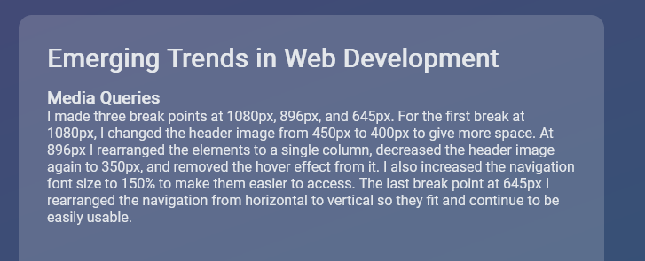
Media Queries
I made three break points at 1080px, 896px, and 645px. For the first break at 1080px, I changed the header image from 450px to 400px to give more space. At 896px I rearranged the elements to a single column, decreased the header image again to 350px, and removed the hover effect from it. I also increased the navigation font size to 150% to make them easier to access. The last break point at 645px I rearranged the navigation from horizontal to vertical so they fit and continue to be easily usable.
Navigation
For the navigation, I made some changes at the different breakpoints. The first change was minor but I increased the font size to 130% at the 1080px breakpoint and to 150% at the 896px breakpoint. The breakpoint at 645px was where I implemented a drop-down menu so it is easier for users with small screens to navigate the navigation bar. The drop-down menu is styled with a hamburger button that opens up a transparent black background to help with text visibility. The drop-down menu is activated with some JavaScript.
New Design Technique
For the new design technique, I tried to make a drop-down menu which is something I have never attempted before. These drop-down menus offer an easier way for users with smaller screens to use the navigation menu for a website. For my drop-down menu, I made another nav section and made it hidden on the larger screens. In my small screen breakpoint, the navigation for larger screens gets hidden and the mobile version gets displayed as a block to appear. I added three div elements and styled them to look like a hamburger button. I added a transform when the button is clicked to show that it was activated. JavaScript was used to get the hamburger button to open. I also gave it a dark transparent background and made the text bigger to make the navigation items easier to read.
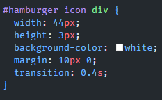
Finger Pixel Width
For the finger pixel width, I made the button for my drop-down menu to be 44px. I went with Apple's standard suggested pixel width of 44px. I did this because when I tested larger pixel sizes it just felt like the button was getting too big. To make the button bigger I set the width to 44px of the #hamburger-icon div selector.
Design Guidelines
Content Breakpoints
With this design, I wanted to let the content decide where the breakpoints needed to be. Rather than just putting in a pixel size of the newest phone screen size. I played with the size to see when the content needed to be adjusted and that's where I put my breakpoints. This may not always work with a design, but I think it is important to learn. Websites designed for desktops that need to be converted into a mobile site might benefit from this style of design to ensure everything works as intended.
Typography
I wanted to ensure that my text was readable at all the different levels of my site. I wanted to distinguish the different levels of text from the heading elements and the basic body text. I also wanted to provide enough space around the different text elements to make reading easier.
REM Units
I wanted to try and use some rem units in my design to have some of the spacing and sizing be based on the size of the design. I did use px on some elements where I wanted the spacing and size to be absolute. With REM units being relative units they can help with scaling elements in a webpage. This can apply to font size, margin, and padding. The REM units help to scale things proportionally to the base root element's font size. This can help with accessibility because users can set a default font size in their browser and this helps browsers to scale better.
SEO
For my SEO I added meta tags for things such as the viewport, description, keywords, and author. I also included a title for the website. Throughout the rest of the website, I used current semantic HTML 5 elements along with alt text for images and links for accessibility. Providing a meta description can help provide search engines with a better snippet to display so users might be more inclined to visit a site. The semantic markup helps search engines understand and index your content. It can also help to produce better accessibility and help ensure content is properly displayed across many devices.